Content - 內容區塊
文字方塊。
TIP
組件 Content 為全域組件,不須 import 即可直接使用。
範例
vue
<template>
	<Content>
		預設為灰色系的外框和底色。
	</Content>

	<Content colorStyle="red">
		紅色系的外框和底色,適合用在錯誤訊息。
	</Content>

	<Content borderColor="#f3f" bgColor="#fdf">
		自訂邊框和背景的顏色 ฅ^⦁⩊⦁^ฅ ੭
	</Content>

	<Content colorStyle="green" collapsed>
		綠色系的外框和底色,寬度會隨著內容大小改變。
	</Content>
</template>

<style scoped>
div:not(:first-child) {
	margin-top: 10px;
}
</style>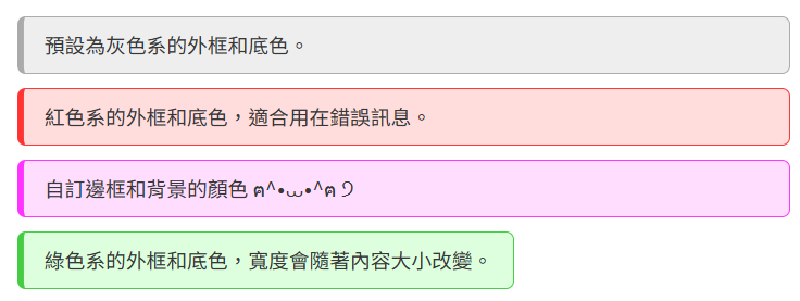
組件參數
props. | Type | Default | Description |
|---|---|---|---|
borderColor | string | #aaa | 邊框顏色,記得要加 # |
bgColor | string | #eee | 背景顏色,記得要加 # |
colorStyle | string | null | 顏色風格:gray | blue | red | green若傳入的風格存在會覆蓋掉 borderColor 和 bgColor |
collapsed | Boolean | false | 若為 true,內容區塊的 div 的大小會隨著內部元素改變 |
colorStyle
目前有四種顏色風格 red、green、blue、gray。
collapsed
請參考上圖,上圖只有綠色區塊是 true,其他都為 false。